前言
- CSS(Cascading Style Sheets,层叠样式表)负责网页的呈现:颜色、字号、间距、位置、响应式行为。HTML 说「这是什么」,CSS 说「它长什么样」。
- 本篇的所有数字都是实测出来的:本机 Chrome,视口
888 × 858,devicePixelRatio = 1.25,根字号 16px。换浏览器、换系统字体、换窗口大小都会变,所以重点看规律而不是绝对值。
一句话说清「层叠」
CSS 的一条最终样式,是四件事叠加的结果:来源 → 层(layer)→ 优先级(specificity)→ 书写顺序。
- 来源:浏览器默认样式 < 用户样式表 < 作者样式表(我们写的)。
- 层:
@layer 显式分层后,未分层的样式永远赢过分层的样式,与权重无关。实测:1
2
3
4
5
6
7
8
9
| @layer base {
#layer1 { color: rgb(101, 101, 101); }
}
#layer1 { color: rgb(102, 102, 102); }
@layer base {
#layer2 { color: rgb(103, 103, 103); }
}
.plain { color: rgb(104, 104, 104); }
|
id 权重在分层面前不起作用。
- 优先级:见下一节。
- 书写顺序:前三步都平手时,写在后面的赢。
继承(inherit)不参与优先级竞争:只要有任何一条规则命中元素,就轮不到继承值。实测 .parent { color: A } 里的 <p class="k8"> 被 p.k8 { color: B }(权重仅 0,1,1)覆盖。
语法构成
1
2
3
4
5
6
|
选择器1,
选择器2 {
属性: 值;
属性2: 值 单位;
}
|
- 选择器与
{ 之间、: 两侧的空格都可有可无;属性名和值之间必须有冒号,单位紧跟数字不能有空格(margin: 10 px 无效,margin: 10px 才对)。
- 大小写:标签名、属性名、关键字不区分大小写(
COLOR: RED 合法),但类名/ID 区分(.Box 与 .box 不同)。约定全部小写最省心。
- 属性名不能拼错也不能用驼峰:
background-color 不是 backgroundColor(只有写在 JS 里才驼峰)。
三种引入方式
1
2
3
4
5
6
7
8
9
10
11
12
13
14
15
16
17
18
19
20
21
22
23
24
25
| <!DOCTYPE html>
<html lang="zh-cn">
<head>
<meta charset="utf-8">
<title>CSS 引入方式</title>
<style>
p {
color: white;
}
</style>
<link rel="stylesheet" href="05-css.css">
</head>
<body style="background-color: orange;">
<p>曾经沧海难为水,除却巫山不是云</p>
<div>床前明月光,疑是地上霜</div>
</body>
</html>
|
| 方式 |
写在哪 |
复用范围 |
什么时候用 |
行内 style |
标签属性 |
单个元素 |
只有一处、且值是 JS 动态算出来的(如进度条宽度) |
内部 <style> |
当前页 head |
单个页面 |
单页工具、邮件模板、示例代码 |
外部 <link> |
.css 文件 |
整个站点 |
默认选择:可缓存、可复用、职责清晰 |
- 行内样式在层叠里权重最高(
1,0,0,0),这也是「为什么我 CSS 写了没效果」的头号原因。
<link> 建议放 <head>,避免先渲染无样式内容(FOUC)。
选择器与优先级
优先级怎么算:四元组 (a, b, c, d)
| 位置 |
计数内容 |
例子 |
a |
行内样式(写在 style="" 里) |
1,否则 0 |
b |
ID 选择器个数 |
#nav → 0,1,0,0 |
c |
类、属性、伪类个数 |
.btn、[type="text"]、:hover → 各算一个 |
d |
元素选择器、伪元素个数 |
p 算一个,::before 算一个 |
| — |
通配 *、组合器(> + ~ 空格)、:where()、:is()/:where()/:not()/:has() 内部的贡献为 0 |
:is(#a, .b) 整体按最高的那个算(即 #a 的 1,0,0,0) |
比大小从高位到低位逐位比较,不跨位进位:0,99,0,0 也赢不过 1,0,0,0。
实测结论(同一页面里,读最终 color):
| 对局 |
结果 |
#r1(1,0,0) vs .k1a.k1b.k1c.k1d(0,4,0) |
id 赢 |
.k2(0,1,0) vs 后写的 [data-k2](0,1,0) |
后写的赢(等权重看顺序) |
同一条 .k3 写两遍 |
后一遍赢 |
样式表里 .k4 { …!important } vs 行内普通样式 |
!important 赢 |
行内 !important vs #case5 …!important |
行内赢(行内是 1,0,0,0,压过 id 的 0,1,0,0) |
.k6(0,1,0) vs :is(#not-exist-id, .k6)(1,0,0) |
:is 赢,即使那个 id 根本不存在 |
.k7(0,1,0) vs :where(#not-exist-id, .k7)(0,0,0) |
.k7 赢,:where 不加分 |
p.k8(0,1,1) vs 从父元素继承的颜色 |
规则赢,继承不参与竞争 |
结论性建议
- 别用
!important 解决优先级问题;它是逃生舱,用来覆盖第三方库。用多了只能靠更 !important 往上叠。
a 位(行内)几乎打不过,除非你也用 !important。所以动态样式尽量用 CSS 变量或类名切换,而不是 el.style.xxx。- 类名扁平一点:
.card .body .title span 这种长链权重高、难覆盖、还容易因 DOM 变化失效。项目里更常见的是给元素本身一个类(.card-title)。
- 想让选择器不增加权重,套一层
:where()::where(:not(:last-child))、:is() 用来合并写法。
基础与复合选择器
1
2
3
4
5
6
7
8
9
10
11
12
13
14
15
16
17
18
19
20
21
22
23
24
25
26
27
28
29
30
31
32
33
|
p { color: blue; }
.highlight { background-color: yellow; }
#header { font-size: 24px; }
div.banner.hot { border: 1px solid red; }
article p { line-height: 1.8; }
ul > li { list-style-type: none; }
h2 + p { margin-top: 0; }
h2 ~ p { color: #444; }
h1, h2, h3 { font-weight: 700; }
* {
margin: 0;
padding: 0;
box-sizing: border-box;
}
|
div p 与 div > p 的区别是「后代」与「子代」,这是新手最容易踩的一条。.a .b(空格)≠ .a.b(交集):前者要求 b 是 a 的后代,后者要求同一元素同时有两个类。
属性选择器
1
2
3
4
5
6
7
| input[required] { border-color: red; }
input[type="text"] { background-color: lightgray; }
a[href^="https://"] { color: green; }
a[href$=".pdf"] { padding-right: 18px; }
img[src*="thumb"] { border: 1px solid #ccc; }
[class|="btn"] { font-weight: bold; }
input[type="search" i] { width: 100%; }
|
[attr] 匹配的是写在 HTML 里的属性,不是 JS 改过的属性值——用 el.href = x 不会让 [href="x"] 命中(要改必须 setAttribute)。- 属性选择器权重与类相同(
0,1,0)。
伪类(状态)
1
2
3
4
5
6
7
8
9
10
11
12
| a:link { color: blue; }
a:visited { color: purple; }
a:hover { color: red; }
a:active { color: orange; }
a:focus-visible { outline: 2px solid #06c; }
input[type="checkbox"]:checked + span { font-weight: 700; }
input:focus { border-color: #06c; }
input:disabled { background: #f5f5f5; color: #999; }
input:invalid { border-color: #d33; }
li:first-child, li:last-child, li:nth-child(2n) { }
p:not(.note) { color: #333; }
|
- 链接四态的顺序建议 LoVe FAIR(
:link → :visited → :hover → :active),否则后写的会被前面的盖掉。
:visited 出于隐私限制,浏览器只允许改少量颜色相关属性,且 JS 读不到访问状态;实测给 a:visited 写 background-color 时,计算值仍是透明。:focus-visible 比 :focus 好用:鼠标点击不显示轮廓,键盘 Tab 才显示。:nth-child(An+B) 里 2n 即偶数、2n+1 奇数、3n 每第三个;:nth-of-type 按同类型元素计数。
伪元素
1
2
3
4
5
6
| p::before { content: "→ "; color: red; }
button::after { content: " Click me!"; font-weight: 700; }
p::first-letter { font-size: 2em; color: blue; }
p::first-line { font-weight: bold; }
::selection { background: yellow; color: black; }
li::marker { color: rgb(77, 88, 99); }
|
:: 是两个冒号,: 是伪类。历史原因允许 :before 这种单冒号写法,但统一用双冒号更清楚。- 伪元素不是真实节点:JS 取不到它、也点不到它;
content: "" 时它依然存在(这就是画三角形、画小圆点的基础)。
- 实测
li::marker { color } 能改项目符号颜色,list-style-type 也能在 ::marker 里重写。
现代选择器补充(实测本机 Chrome 全支持)
1
2
3
4
| article:has(> img) { border: 1px solid red; }
:is(h1, h2, h3) .title { color: red; }
:where(h1, h2, h3) .title { color: red; }
input:-webkit-autofill { box-shadow: 0 0 0 1000px #fff inset; }
|
:has() 是 CSS 里长期缺失的「向上选」,CSS.supports('selector(:has(*))') 实测 true。:is() 写起来省字,但会继承参数里最高的权重,覆盖时容易翻车;不确定就用 :where()。
长度单位与数值
实测换算(视口 888×858,dpr 1.25,根字号 16px)
| 单位 |
含义 |
实测 |
px |
CSS 逻辑像素(不是物理像素) |
基准,1in = 96px |
1pt |
排版点,1/72 英寸 |
1.33333px |
1pc |
排版派卡,12pt |
16px |
1in |
英寸 |
96px |
1cm |
厘米 |
37.7953px |
1mm |
毫米 |
3.77953px |
1em |
当前元素自己的 font-size 倍数 |
父 2rem 时,子 0.875em = 28px |
1rem |
根元素(<html>)font-size 倍数 |
2rem = 32px |
1%(字号) |
相对父元素字号 |
150% = 24px |
1ch |
字体「0」的 advance 宽度 |
10ch = 88.8px |
1ex |
字体 x-height |
2ex = 17.376px |
1vw |
视口宽度的 1% |
8.88px(888/100) |
1vh |
视口高度的 1% |
8.576px(858/100) |
50dvh |
动态视口高度(含/不含浏览器工具栏都会跟着变) |
428.8px |
用哪一族的经验
- 字号:
rem 给全局尺度(改一处根字号,整站跟着缩放,对用户也更友好),组件内部用 em 让它跟着自身字号走。
- 间距:
px/rem;% 用来做与父宽挂钩的间距。
- 大块的「铺满/占几成」:
%、vw/vh,视口高度在手机上有历史包袱,尽量用 dvh(实测支持)。
百分比 padding/margin 的坑(实测)
1
2
3
4
5
| .card {
width: 200px;
padding: 10%;
font-size: 10px;
}
|
父容器内容宽度为 872.75px 时,实测 padding-left = 87.275px。也就是说:
- 上下 padding / margin 的百分比也按「宽度」算,这是做「16:9 占位块」(
padding-top: 56.25%)的原理。
- 只有
font-size、line-height 的百分比才是按字号来的。
calc() 与函数族(实测)
1
2
3
4
5
6
7
| .bar {
width: calc(100px + 2rem);
max-width: min(80%, 250px);
width: clamp(100px, 50%, 300px);
height: 50dvh;
line-height: 1.5lh;
}
|
calc() 里 + - * / 两侧必须有空格(calc(100%-10px) 无效)。min() / max() / clamp() 是「响应式不需要媒体查询」的主力:font-size: clamp(1rem, 2.5vw, 1.5rem) 一行搞定随屏放大又不失控。- 关键字类取值:
auto、inherit、initial、unset、revert;none、normal、block 等按属性而定。min-width / max-width 是属性名,不是单位也不是关键字。
数字与颜色字面量
1
2
3
4
5
6
7
8
9
10
11
| p {
color: rgb(51, 51, 51);
color: rgba(51, 51, 51, 0.5);
color: #333333;
color: #333;
color: #33333380;
color: hsl(210deg 50% 40%);
color: hsl(210 50% 40% / 0.5);
color: rebeccapurple;
color: color-mix(in oklab, red 30%, blue);
}
|
color-mix() 实测在 Chrome 里返回的是 oklab(...) 而不是 rgb——它是「按感知均匀的色彩空间混合」,比老式 rgba 叠加更可控(CSS.supports('color: color-mix(in oklab, red, blue)') = true)。- 透明度优先用带 alpha 的颜色,而不是
opacity: ——后者会让整个元素(含子元素、含文字)都变透明,并且会创建层叠上下文。
字体与文本
字体族:font-family 是一条「降级链」
1
2
3
4
5
6
7
8
9
10
| body {
font-family: "Helvetica Neue", Helvetica, Arial, "PingFang SC",
"Microsoft YaHei", "Noto Sans SC", sans-serif;
font-size: 1rem;
line-height: 1.6;
}
code, pre, kbd {
font-family: Consolas, "Courier New", monospace;
}
|
- 结尾一定要留一个通用族(
serif、sans-serif、monospace、cursive、system-ui、math、emoji…)。
- 实测本机
<body> 的默认字体族被解析成 "Noto Sans SC"——默认值取决于系统,所以「我这看着好,你那看着歪」是正常的,别依赖默认字体。
- 中文字体名一定要引号包裹;
PingFang SC(苹果)、Microsoft YaHei(Windows)、Noto Sans SC/Source Han Sans(跨平台)是常见组合。
字号、粗细、倾斜
| 属性 |
常用值 |
实测/注意 |
font-size |
16px、1rem、clamp(...) |
浏览器最小字号限制会让 font-size: 8px 看起来是 12px(中文环境常见) |
font-weight |
100~900、normal(400)、bold(700) |
只有该字重真的存在才有效果;b/strong 默认 700 实测与 CSS 写 700 一致 |
font-style |
normal、italic、oblique |
字体没做真斜体时浏览器会倾斜拉伸(伪斜体),中文尤其明显 |
font-variant |
small-caps、tabular-nums |
数字用等宽 font-variant-numeric: tabular-nums 对齐表格 |
font-feature-settings |
"liga" 0 |
精细控制 OpenType 特性,日常用 font-variant-* 更可读 |
line-height:三种写法的差别(实测)
1
2
3
4
| .a { font-size: 16px; line-height: normal; }
.b { font-size: 16px; line-height: 1.6; }
.c { font-size: 16px; line-height: 16px; }
.d { font-size: 16px; line-height: 150%; }
|
- 推荐写无单位倍数(
1.6):它传给子元素的是「比例」,子元素按自己的字号重新计算;写 1.6em 或 150% 时子元素继承的是已算出的长度,嵌套越深越容易出错。
- 想让单行文字垂直居中:
line-height 等于容器高度即可(多行不行)。
文本修饰与排版
1
2
3
4
5
6
7
8
9
10
11
12
13
14
| p {
color: #333;
text-align: justify;
text-indent: 2em;
text-decoration: underline;
text-transform: capitalize;
letter-spacing: 2px;
word-spacing: 5px;
white-space: normal;
overflow-wrap: break-word;
text-shadow: 2px 2px 4px rgba(0, 0, 0, 0.5);
direction: ltr;
writing-mode: horizontal-tb;
}
|
text-align 只管内联内容在这个块里的对齐;要让块本身居中得靠 margin: 0 auto、flex 或 grid。text-transform 只改渲染,不改 DOM:实测 text-transform: capitalize 之后 el.textContent 仍是 hello world from css。读屏软件、复制粘贴拿到的都是原文。- 中文两端对齐
justify 一般需要 text-align-last: justify(控制最后一行)配合。
单行省略号三件套(实测)
1
2
3
4
5
| .ellipsis {
overflow: hidden;
white-space: nowrap;
text-overflow: ellipsis;
}
|
实测:满足三条件时 scrollWidth 496 > clientWidth 120,出现 …;只写 text-overflow: ellipsis 而不加 nowrap(多行场景)不会生效(实测内容只是换行溢出,scrollWidth 124 / clientWidth 120)。
多行截断要用 -webkit-line-clamp(现在基本所有浏览器都支持):
1
2
3
4
5
6
| .clamp3 {
display: -webkit-box;
-webkit-box-orient: vertical;
-webkit-line-clamp: 3;
overflow: hidden;
}
|
vertical-align 到底在管什么
- 它只对行内元素(inline / inline-block)和表格单元格生效,给块级元素写它没有任何反应——「用
vertical-align: middle 让 div 居中」是无效操作。
- 语义是相对当前行的基线定位,不是「相对父元素居中」。实测(
#va 容器 line-height: 40px,字体 16px,量的是各 span 顶边相对容器顶边的偏移):
| 写法 |
实测顶边偏移 |
baseline |
+18px |
top |
+8px |
middle |
+20px |
bottom |
+20px |
10px |
+8px(在基线上再上移 10px:18 − 10 = 8) |
- 最后一行说明:
vertical-align: <长度> 是相对基线的位移,正数向上。
- 真要「垂直居中」,用 flex(
align-items: center)或 grid(place-items: center)。
颜色与背景
背景属性全家福
1
2
3
4
5
6
7
8
9
10
| .box {
background-color: #ff0000;
background-image: url("bg.png");
background-repeat: no-repeat;
background-position: top right;
background-size: cover;
background-attachment: scroll;
background-origin: content-box;
background-clip: padding-box;
}
|
简写顺序是「color image repeat position / size origin clip」,实测:
1
| .short { background: #ff0000 url("bg.png") no-repeat top right / cover; }
|
| 计算值 |
实测结果 |
说明 |
background-color |
rgb(255, 0, 0) |
简写里可以不带颜色 |
background-repeat |
no-repeat |
— |
background-position |
100% 0% |
关键字 top right 被换算成百分比 |
background-size |
cover |
斜杠后面就是 size |
background-attachment |
scroll |
默认值 |
多背景(先写的在上层):
1
2
3
4
5
| .hero {
background-image: url("pattern.png"), linear-gradient(#ffffff, #000000);
background-repeat: no-repeat, repeat;
background-size: cover, auto;
}
|
- 渐变本身就是
background-image 的一种:linear-gradient(45deg, red, blue)、radial-gradient(circle at 30% 70%, …)、conic-gradient(…)(做饼图/角度色环很省事)。
background-clip: text + -webkit-text-fill-color: transparent 可以做「渐变文字」。- 半透明遮罩的标准做法:把
linear-gradient(rgba(0,0,0,.4), rgba(0,0,0,.4)) 作为第一层背景,图片作为第二层,不用额外加一个 div。
background-attachment 三个值的真实差别
1
2
3
| scroll 背景相对元素固定:元素随页面滚走,背景跟着走,但不会在元素内部偏移(默认)
fixed 背景相对视口固定:滚动页面时背景纹丝不动(常用于全屏大图;移动端浏览器支持不佳)
local 背景随元素内容滚动:元素自身出现滚动条时,背景跟着内容一起移动
|
原笔记把 scroll 解释成「随内容滚动」,正好和 local 说反了。
前景色与边框
1
2
3
4
5
6
7
8
9
10
11
| .card {
color: #1a1a1a;
border: 1px solid #ddd;
border-radius: 8px;
border-top-left-radius: 0;
outline: 2px solid #06c;
outline-offset: 2px;
box-shadow: 0 2px 8px rgba(0, 0, 0, .12);
filter: drop-shadow(0 2px 4px rgba(0,0,0,.3));
}
|
border 有宽度就一定占空间(盒模型里算进去),outline 不占——所以聚焦态用 outline 不会引起抖动。- 圆角配合
border-radius: 50% 做圆形头像,前提是先固定宽高。
- 想要「1 物理像素」的细线(Retina 屏上
1px 看着偏粗),常见做法是画一条 transform: scaleY(.5) 的线。
盒子模型
每个元素都是一个矩形盒子,从内到外:content → padding → border → margin。
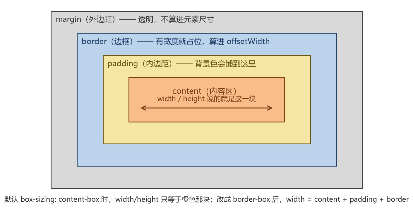
实测:box-sizing 改变的是「width 指什么」
1
2
3
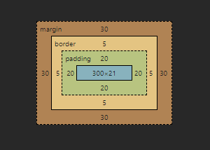
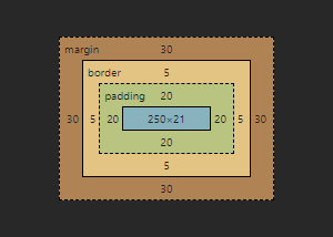
| .box { width: 300px; padding: 20px; border: 5px solid black; margin: 30px; }
.content-box { box-sizing: content-box; }
.border-box { box-sizing: border-box; }
|
| 量法 |
content-box |
border-box |
解释 |
style.width 声明值 |
300px |
300px |
都是 300px,但含义不同 |
getBoundingClientRect().width |
350 |
300 |
350 = 300 + 20×2 + 5×2 |
offsetWidth |
350 |
300 |
border 外沿 |
clientWidth |
340 |
290 |
border 内沿(= 内容 + padding) |
- 标准盒模型:
width 只是内容宽,实际占位要再加 padding 和 border。
border-box:width 就是 border 外沿的总宽,padding/border 从里面扣(内容宽变成 250px)。- 所以现在几乎每个项目都先写一句全局重置:
1
2
3
| *, *::before, *::after {
box-sizing: border-box;
}
|
示意图(原笔记留下的两张图仍然适用):
margin:会合并、会穿透(全部实测)
1
2
| .a { margin: 20px; height: 30px; }
.b { margin: 30px; height: 30px; }
|
- 相邻块级元素的上下 margin 合并:实测
.a 下边 20px 与 .b 上边 30px 之间的实际间距是 30px,不是 50px(取较大者;有负值时按 最大值 + 最小值 计算)。
- 父子穿透:父元素没有
border-top / padding-top 时,子元素的 margin-top 会「冒」到父元素外面。实测子元素 margin-top: 40px:
- 普通父容器:子元素顶边相对父容器顶边偏移 0px(margin 穿透,把整块往下推)
- 父容器加
padding-top: 1px:偏移 41px(穿透被打断)
- 父容器改
display: flow-root:偏移 40px(干净的阻断方式,不需要真的加内边距)
- 空盒子自己合并:上下 margin 直接穿过去合并,中间不留高度(实测高度 0)。
- 阻断 margin 合并的常用手段:
display: flow-root(现代首选)、padding/border、overflow: hidden(副作用是裁掉溢出内容)、变成 flex/grid 容器(其子项不合并)。
- 行内元素上下 margin 无效:实测给
<span> 写 margin: 30px; width: 300px; height: 100px; 后,它的盒子只有 287 × 43——width/height 被忽略,高度由行高决定;左右 margin 有效。同一份样式写在 display: inline-block 上是 320 × 120(宽高都生效)。
padding / margin 简写
1
2
3
4
5
6
7
| .x { padding: 10px; }
.x { padding: 10px 20px; }
.x { padding: 10px 20px 30px; }
.x { padding: 10px 20px 30px 40px; }
.x { margin-inline: auto; }
.x { margin-block: 10px 20px; }
.x { gap: 12px; }
|
- 让定宽块元素水平居中:
margin-inline: auto(等价 margin: 0 auto)。
gap 以前只有 grid 能用,实测现在 flex 也支持(gap: 12px 计算值生效),比用负 margin 补间距干净得多。
定位
position 五个值
| 值 |
是否占原位置 |
相对谁定位 |
典型用途 |
static |
在流内 |
—(top/left 无效) |
默认 |
relative |
保留原位置占位 |
自己原来在流里的位置 |
局部微调、给子 absolute 当参照 |
absolute |
脱离流 |
最近的非 static 祖先,没有则相对初始包含块 |
弹层、角标 |
fixed |
脱离流 |
视口(除非祖先有 transform/filter/will-change 等) |
常驻顶栏、返回顶部 |
sticky |
在流内 |
滚动容器 + top/left/... 阈值 |
表格标题行、分组吸顶 |
1
2
3
4
| .relative { position: relative; top: 10px; left: 20px; }
.absolute { position: absolute; top: 30px; right: 40px; }
.fixed-bar { position: fixed; bottom: 0; left: 0; right: 0; }
.header { position: sticky; top: 0; }
|
sticky 实测(外层容器 height: 60px; overflow: auto,内含 position: sticky; top: 5px 的小条 + 300px 高内容):容器滚动 100px 后,sticky 条的视口位置保持 2429 → 2429 不变,而普通子元素从 2447 移到 2347(被内容一起滚走了)。这就是「粘住」的直观证据。
sticky 常见的「不生效」原因:
- 没写
top/bottom/left/right 任何一个阈值;
- 祖先里有
overflow: hidden/auto 之类的裁剪容器,粘性只在那个容器内起作用;
- sticky 元素的父容器高度就等于它自己(没有可粘的行进空间);
- 写了
display: inline-block(粘性定位对行内元素无效,块级或 flex 子项才有意义)。
inset 是四个偏移的简写
1
2
3
4
5
| .overlay {
position: absolute;
inset: 4px;
}
.half { inset-block-start: 0; }
|
z-index 与层叠上下文
1
2
| .behind { position: absolute; z-index: 1; left: 0; top: 0; }
.in-front { position: absolute; z-index: 2; left: 50px; top: 50px; }
|
- 数值大在上;同为
auto/相同数值时按文档顺序后来者居上。
z-index 只在同一个层叠上下文内比较,父级上下文先于子级排序——「我 z-index 写到 9999 还被别人盖住」几乎都是这个问题(父元素形成了更低层级的上下文)。- 原笔记说「只对定位元素有效」,已经过时:实测
display: flex 的两个静态子项(position: static),z-index: 3 的那个确实盖住了 z-index: 1 的那个(elementFromPoint 命中上层的 id)。flex/grid 子项的 z-index 同样参与叠放。
- 会创建新层叠上下文的常见写法:
position 非 static 且 z-index 非 auto。opacity < 1。transform/filter/backdrop-filter/will-change。position: fixed/sticky。isolation: isolate。flex / grid 的子项且 z-index 非 auto。- 想让某个「相对层级」独立出来,最干净的写法是
isolation: isolate。
水平垂直居中:四种做法
1
2
3
4
5
6
7
8
9
10
11
12
|
.c1 { position: absolute; left: 50%; top: 50%; width: 200px; height: 100px; margin: -50px -100px; }
#box-parent { position: relative; width: 300px; height: 200px; }
.c2 { position: absolute; left: 50%; top: 50%; transform: translate(-50%, -50%); }
.parent-flex { display: flex; align-items: center; justify-content: center; }
.parent-grid { display: grid; place-items: center; }
|
- 只有「一行文字垂直居中」这种场景还适合用
line-height = height。
- 单个块元素水平居中:
margin-inline: auto + 固定/最大宽度。
布局
display 家族
| 值 |
行为 |
备注 |
block |
独占一行,宽度撑满 |
div、p、h1… 默认(实测 display: block) |
inline |
跟着文字排,宽高与上下 margin/padding 无效 |
span、a、b… |
inline-block |
外部像行内、内部像块 |
实测 width: 300px 生效(320×120 含 padding) |
flex |
一维弹性布局 |
子项的 float/vertical-align 失效 |
grid |
二维网格布局 |
子项同样不能用 float |
flow-root |
生成独立块格式上下文 |
实测可用,专门用来阻断 margin 合并 |
contents |
盒子「消失」,子节点直接参与父级布局 |
实测有效,但会让该元素在无障碍树里也消失,慎用 |
table/table-cell |
表格布局 |
除了真正的表格数据,别再拿它排版 |
none |
完全不渲染 |
与 visibility: hidden(占位)不同 |
默认 overflow: visible |
实测根元素计算值就是 visible |
溢出内容照样绘制,可能与相邻元素重叠 |
Flexbox(一维)
1
2
3
4
5
6
7
8
9
10
11
12
13
14
15
| .navbar {
display: flex;
flex-direction: row;
justify-content: space-around;
align-items: center;
flex-wrap: wrap;
align-content: space-between;
gap: 12px 20px;
}
.navbar > li {
flex: 1 1 auto;
align-self: flex-end;
order: 2;
}
|
justify-content 可用值比原笔记列的多:normal、start、end、center、space-between、space-around、space-evenly、left、right。实测 space-evenly 生效(三者等距,含两端)。align-items 除了 flex-start/flex-end/center/baseline/stretch,还能直接写 Box Alignment 的关键字:实测 align-items: end 有效。flex: 1 是 flex: 1 1 0%,flex: auto 是 1 1 auto。想让一列按内容、其余列填满剩余,就写 flex: 0 0 auto + flex: 1。flex-basis 才是伸缩的起点;写 width 也能,但 basis: 0 表示「忽略内容宽度重新分配」,做等分列更稳。- 三个高频坑:
- flex 子项里的文字要截断,必须给它
min-width: 0(默认 auto 不允许收缩到内容宽度以下)。
- 交叉轴高度想撑满用
align-items: stretch(默认值,但要求子项没写高度)。
- 用
gap 而不是 margin,避免最后一项多余外边距。
导航栏完整示例(把原笔记里非法的 <li> 收进 <ul>):
1
2
3
4
5
6
| <ul class="navbar">
<li><a href="#">Home</a></li>
<li><a href="#">About</a></li>
<li><a href="#">Services</a></li>
<li><a href="#">Contact</a></li>
</ul>
|
1
2
3
4
5
6
7
8
9
10
11
12
13
14
15
16
17
18
19
20
21
| .navbar {
display: flex;
justify-content: space-around;
align-items: center;
gap: 0 8px;
margin: 0;
padding: 10px 0;
list-style: none;
background-color: #333;
}
.navbar a {
padding: 5px 15px;
color: white;
text-decoration: none;
transition: background-color 0.3s;
}
.navbar a:hover {
background-color: #555;
}
|
Grid(二维)
1
2
3
4
5
6
7
8
9
10
11
12
13
14
15
16
17
18
19
20
21
22
23
24
25
26
27
| .layout {
display: grid;
grid-template-columns: 1fr 3fr;
grid-template-rows: auto 1fr auto;
gap: 10px;
min-height: 100dvh;
grid-template-areas:
"head head"
"side main"
"foot foot";
}
.layout > header { grid-area: head; }
.layout > aside { grid-area: side; }
.layout > main { grid-area: main; }
.layout > footer { grid-area: foot; }
.span-all {
grid-column: 1 / -1;
}
.card { grid-column: span 2; }
.gallery {
display: grid;
grid-template-columns: repeat(auto-fit, minmax(200px, 1fr));
gap: 16px;
}
|
fr 是「剩余空间的一份」,只在 grid/flex 的轨道尺寸里可用。repeat(auto-fit, minmax(200px, 1fr)) 是首选的自适应网格:容器变窄时自动减少列数,一行代码替掉三四个媒体查询。align-items / justify-items 管格子里的对齐。align-content / justify-content 管轨道整体在容器里的分布。place-items 是前两者的简写(实测 place-items: center 生效)。单个项目还能用 justify-self / align-self 覆盖。- 原笔记担心 grid 的
justify-content: stretch 不合法:实测 Chrome 接受并保留为 stretch(grid 里它确实是个合法值,行为等同轨道拉伸)。
- 子项默认会自动按行排列;不想手写行数列数就靠
grid-auto-flow: column 之类。
subgrid 实测支持(CSS.supports('grid-template-columns: subgrid') = true),可以做「卡片内的按钮对齐到同一列」。
老式 Float 布局(读旧代码要用)
1
2
3
4
5
6
7
8
9
10
11
12
| .clearfix::after {
content: "";
display: block;
clear: both;
}
.col {
float: left;
width: 33.333%;
padding: 10px;
box-sizing: border-box;
}
|
float 的本来用途是文字环绕图片,被拿来排版是历史偶然。- 浮动会使父容器高度塌陷(子元素脱离正常流,父容器「看不到」它们),所以要清除浮动:现代写法是给父容器
display: flow-root(实测可用,无需伪元素),比 .clearfix 更短。
- 三列等分为什么必须配
box-sizing: border-box:33.333% + 10px padding × 2 在 content-box 下超过三分之一,第三列会被挤下去。
响应式
1
| <meta name="viewport" content="width=device-width, initial-scale=1">
|
1
2
3
4
5
6
7
8
9
10
11
12
13
14
|
.box { width: 100%; }
@media (min-width: 601px) {
.box { width: 50%; }
}
@media (min-width: 961px) {
.box { width: 33.333%; }
}
@media (prefers-color-scheme: dark) { body { background: #111; color: #eee; } }
@media (prefers-reduced-motion: reduce) { * { animation: none !important; } }
@media print { nav, footer { display: none; } }
|
- 必须写 viewport meta,否则手机上媒体查询按 980px 这类「布局视口」计算,断点看着像失效。
- 断点建议按内容需要定,别照抄「手机 600 / 平板 960」。写
min-width(移动优先)比 max-width 更容易维护。
- 原笔记在媒体查询里用
only screen,那是给老式浏览器兜底的写法,现在可省。
- 媒体查询实测:当前视口 888px,
matchMedia('(max-width: 600px)').matches = false、(min-width: 601px) = true;(prefers-color-scheme: dark) = false、(hover: hover) = true、(pointer: coarse) = false。
- 内容驱动的自适应优先用这些「免断点」手段:
clamp()、min()/max()、flex-wrap、grid + minmax(auto-fit)、aspect-ratio、object-fit、容器查询:
1
2
3
4
5
| .card-container { container-type: inline-size; }
@container (min-width: 400px) {
.card { display: grid; grid-template-columns: 120px 1fr; }
}
|
布局方案怎么选
| 需求 |
选择 |
| 一行里的东西对齐、分布 |
flex |
| 页面整体区块、卡片墙、需要行列同时对齐 |
grid |
| 图文环绕 |
float(这才是它的本职) |
| 局部脱流(角标、弹层) |
absolute |
| 常驻工具条、吸顶 |
fixed / sticky |
| 老项目维护 |
float + clearfix 或 flow-root |
列表与表格样式
list-style 全家福
1
2
3
4
5
6
7
8
9
10
11
12
13
14
15
16
17
18
19
20
21
22
| ul.menu {
list-style: none;
}
ul.doc {
list-style-type: square;
list-style-position: inside;
list-style-image: url("bullet.png");
}
ol.cn {
list-style-type: cjk-ideographic;
list-style-type: simp-chinese-informal;
list-style-type: trad-chinese-formal;
list-style-type: lower-greek;
padding-left: 1.5em;
}
li::marker {
color: rgb(77, 88, 99);
font-weight: 700;
}
|
简写 list-style: circle inside url("bullet.png") 实测计算值拆出来正是 type=circle、position=inside、image=url("…/bullet.png")。
自定义编号还能用 @counter-style(实测 Chrome 支持 list-style-type 引用自定义样式),比如「A1、A2、B1…」这类复合序号,比自己拼 ::before 更规范。
用伪元素画自定义符号,比 list-style-image 更好控制对齐:
1
2
3
4
5
6
7
8
9
10
11
12
13
14
15
16
17
18
19
20
| ul.tick {
list-style: none;
padding-left: 0;
}
ul.tick li {
position: relative;
padding-left: 1.5em;
}
ul.tick li::before {
content: "";
position: absolute;
left: 0;
top: 0.45em;
width: 8px;
height: 8px;
border-radius: 50%;
background: #06c;
}
|
表格样式
1
2
3
4
5
6
7
8
9
10
11
12
13
14
15
16
17
18
19
20
21
22
23
24
25
26
27
28
29
| table {
border-collapse: collapse;
width: 100%;
table-layout: fixed;
}
caption {
caption-side: bottom;
font-weight: 700;
padding: 8px;
}
th, td {
border: 1px solid #ccc;
padding: 6px 10px;
text-align: left;
vertical-align: top;
}
thead th { background: #f0f0f0; }
tbody tr:nth-child(2n) { background: #fafafa; }
tbody tr:hover { background: #eef6ff; }
th[scope="row"] { text-align: left; font-weight: 600; }
thead th {
position: sticky;
top: 0;
}
|
- 数字列用
text-align: right + font-variant-numeric: tabular-nums,对齐才好看。
- 手机端横向滚动:外层套
overflow-x: auto 的容器(并给表格一个 min-width)。
动效与「现代 CSS」清单
过渡与动画最小可用版
1
2
3
4
5
6
7
8
9
10
11
12
13
14
15
16
17
18
19
20
21
22
| .btn {
transition: background-color 0.3s ease, transform 0.15s ease;
}
.btn:hover {
background-color: #06c;
transform: translateY(-2px);
}
@keyframes ticker {
from { transform: translateX(0); }
to { transform: translateX(-100%); }
}
.ticker span {
display: inline-block;
animation: ticker 10s linear infinite;
}
@media (prefers-reduced-motion: reduce) {
.ticker span { animation: none; }
}
|
- 只动画
transform 和 opacity(GPU 友好,不触发布局);动画 width/top/left 会强制重排,明显掉帧。
transition 不生效的常见原因:写了 display: none(不可插值)、选择器没命中、属性拼错、值类型不一致(auto ↔ 100px)。animation-play-state: paused、transition-behavior: allow-discrete(实测支持)可以解决「进场/退场动画」这类老难题。
本机 Chrome 实测支持情况(CSS.supports)
| 特性 |
实测 |
:has() 父选择器 |
支持 |
aspect-ratio: 1/1(320px 宽实测高 180px) |
支持 |
flex 容器里的 gap |
支持 |
color-mix(in oklab, …) |
支持 |
container-type: inline-size(容器查询) |
支持 |
dvh / svh 等动态视口单位 |
支持 |
text-wrap: balance(标题不再「一行一字」难看断行) |
支持 |
field-sizing: content(输入框随内容变宽) |
支持 |
backdrop-filter: blur()(毛玻璃) |
支持 |
scroll-behavior: smooth |
支持 |
overscroll-behavior: contain(阻止滚动链) |
支持 |
inset 简写 / translate 独立属性 |
支持 |
accent-color(表单控件主题色,实测 rebeccapurple → rgb(102,51,153)) |
支持 |
subgrid |
支持 |
content-visibility: auto(跳过屏外渲染,长列表提速) |
支持 |
::marker 样式 |
支持 |
list-style-type: cjk-ideographic |
支持 |
lh 单位 |
支持 |
text-spacing-trim(中日韩标点压缩) |
支持 |
transition-behavior |
支持 |
其它值得记住的现代写法:
1
2
3
4
5
6
7
| .grid { display: grid; grid-template-columns: repeat(12, 1fr); }
.ratio { aspect-ratio: 16 / 9; width: 320px; }
.img { object-fit: cover; }
.safe { width: min(92vw, 1100px); margin-inline: auto; }
.text { text-wrap: balance; }
.pop { backdrop-filter: blur(8px); }
.form-field { field-sizing: content; min-width: 6ch; }
|
常见坑速查
- 样式没生效:优先级被压(行内 > id > class)、拼错属性名、值缺单位、选择器没命中(
.a .b 与 .a.b)、元素是 display: inline 却给它写了宽高。
margin: 0 auto 不居中:元素没有设定宽度(auto 宽度会撑满,没有剩余空间可分配)。- 上下间距莫名变小:兄弟 margin 合并(实测 20 与 30 之间只剩 30);父容器高度塌陷则是子元素浮动,或子元素
margin-top 穿透。
width: 100% 却溢出:默认 box-sizing: content-box 时还要再加 padding/border。全局写 box-sizing: border-box。position: absolute 跑到了页面外:祖先里没有一个 position 非 static 的元素。给最近的祖先加 relative。position: fixed 跟着页面滚:某个祖先有 transform/filter/will-change,它就成了 fixed 的新参照物。sticky 不粘:没写 top,或者滚动容器不是你以为的那个。- flex 子项里的长文字不出省略号:忘了
min-width: 0。
- 圆角处背景溢出:
overflow: hidden 或给子元素同样的 border-radius。
z-index 再大也被盖:不在同一个层叠上下文里比较;用 isolation: isolate 把父级独立出来。- hover 动画结束后抖动:动画里改了布局属性;只动
transform/opacity。
line-height: 1.6em 嵌套后行高失控:改用无单位 1.6。- 移动端媒体查询「不生效」:漏了 viewport meta。
- 图片下方那条缝:行内元素基线留白,给
img { display: block; } 或 vertical-align: bottom/middle。
- 写了
!important 才能盖住第三方库:这是允许的;但项目内部样式之间靠 !important 打架是设计问题,改用 @layer 或 CSS 变量。
1px 边框在高倍屏显得粗:transform: scaleY(.5) 伪元素方案,或 border-width: thin。
练习
- 找一个看上去顺眼的页面,试着复刻它的布局:京东、淘宝首页。要求先用 flex/grid,别用
float。
- 给《HTML入门》里那张课程表加上样式:合并边框、斑马纹、悬停高亮、表头吸顶。
- 用
clamp() + grid-template-columns: repeat(auto-fit, minmax(200px, 1fr)) 做一个不用媒体查询也能自适应的卡片墙。
- 亲手复现一次 margin 合并:写两个相邻块元素,用
getBoundingClientRect() 量出它们之间的实际间距,再分别 padding-top: 1px、display: flow-root、overflow: hidden 打断它,观察差异。
参考链接